
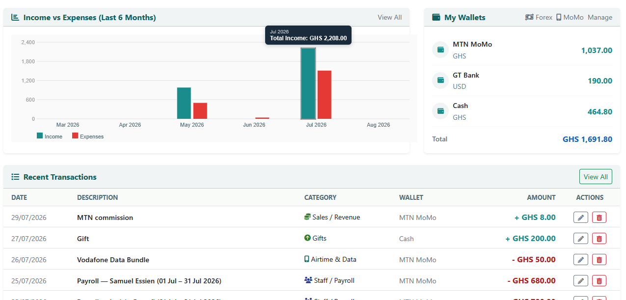
A chart is good at showing you a shape — income climbing, expenses spiking, a slow month standing out against the rest. What it's traditionally bad at is giving you the actual number behind what you're looking at, without a trip somewhere else to find it. The Income vs Expenses chart on your dashboard just got better at that second part.
What changed
Every bar on the chart now responds to you. On a computer, hover your mouse over any bar — income or expenses, any of the last six months — and a small label appears showing exactly which month it is and the precise figure, down to the cedi. On a phone, the same thing happens with a tap: touch a bar, see the number, tap elsewhere to dismiss it.
It sounds like a small thing, and mechanically it is. But it removes a specific, recurring bit of friction: noticing something interesting in the shape of the chart — a spike, a dip, a month that stands out — and wanting to know the actual number behind it, without leaving the dashboard to go dig through Reports for it.
Built for touch first, not as an afterthought
A lot of "hover to see more" features are designed for a mouse and then bolted onto mobile later, often clumsily — a tap that's supposed to work like a hover but doesn't quite, or a tooltip that shows up in the wrong place on a smaller screen. Since most CWS Pocket Ledger usage happens on a phone, this was built the other way around: tested specifically on mobile screens, including making sure the tooltip stays fully on-screen even when you tap a bar sitting right at the edge of the chart, rather than assuming desktop behavior would translate automatically.
Why a detail like this is worth shipping
None of this changes what data you can see — everything the tooltip shows was always available in Reports. What it changes is how many steps it takes to get a specific answer to a specific question. "How much did I actually make in July?" used to mean leaving the dashboard, opening Reports, and finding the right month. Now it means looking at a bar and touching it.
Small reductions in friction like this tend to matter more than they look like they should, because they're the difference between checking your numbers once a week because it's a bit of a process, and glancing at them daily because it takes no effort at all. A business that looks at its own numbers more often tends to catch problems earlier — not because the numbers changed, but because looking at them got easier.
Try it on your own dashboard
Open your Dashboard and look at the Income vs Expenses chart — it's the one showing your last six months. Hover over any bar if you're on a computer, or tap one if you're on your phone. The exact figure for that month, income or expenses, is right there.